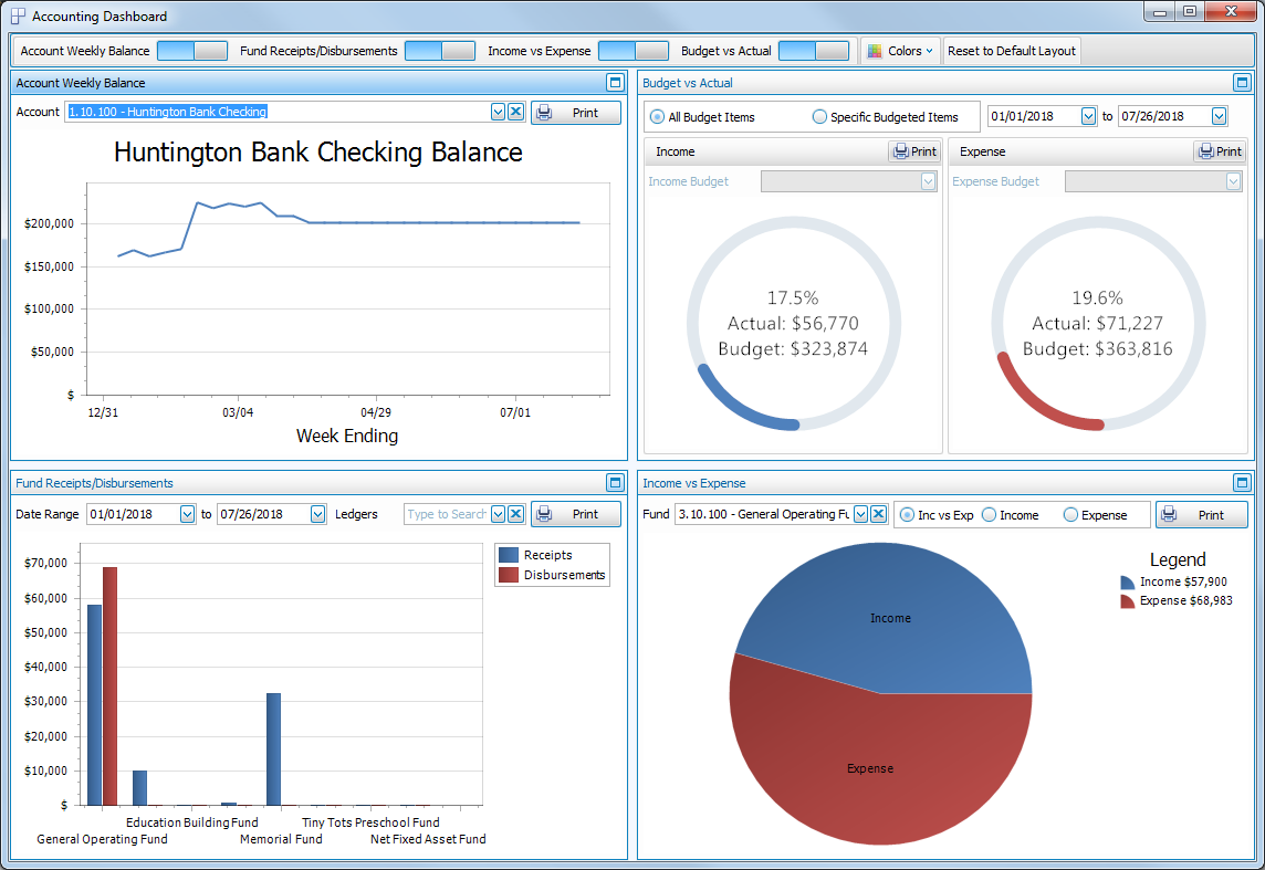
Accounting Dashboard
Four types of graphs are available to view and/or print a visual comparison of various information about the Accounting Transactions, Account Balances, and Budgets recorded in your database. The available graphs are: Account Weekly Balance, Budget vs. Actual, Fund Receipts / Disbursements and Income vs. Expense
To access the Accounting Dashboard screen:
- From The Initial Portal of Church Windows choose Accounting
- Then, from the
in the center of the screen, choose Dashboard
- Or, in the Button Bar at the top of the screen choose Special Functions and then click Accounting Dashboard:
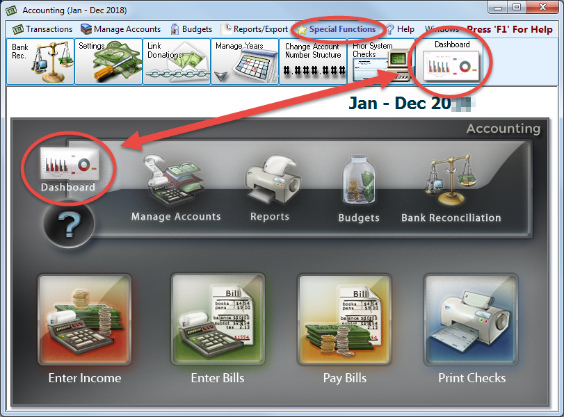
- The Dashboard will look like this:
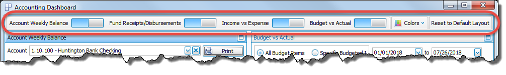
Across the top of the Dashboard window is a toolbar with several buttons:
- On / Off switches for each of the graphs:

If you can't see all of the graph switches, there will be a small down arrow button to the right that you can click to reveal the rest of the switches: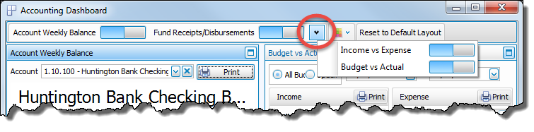
-
 Colors
A dropdown menu to select the color scheme applied to the graphs: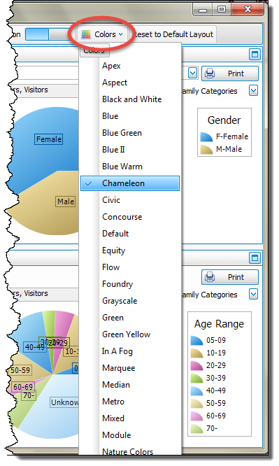
- Reset to Default Layout
Used to return the dashboard to its original setup after making one of the graphs full screen or turning some of the graphs off.
In the top right corner of each graph are two buttons:
-
 Maximize which will make that graph full screen.
 -
 Minimize which will return the graph to its original size alongside the other graphs.
 -
 click Print to view a Print Preview and then proceed in sending the graph to your printer. A window will open allowing you to change the font and the page orientation, if desired:
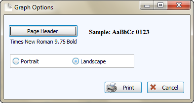
You can also Export graphs and/or Send via Email as a file to be opened outside of Church Windows.
Or
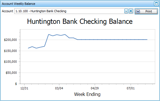
Account Balance
Select any of your accounts from the  dropdown to see a simple line graph of the Weekly or Monthly account balance from the beginning of the accounting year through today:
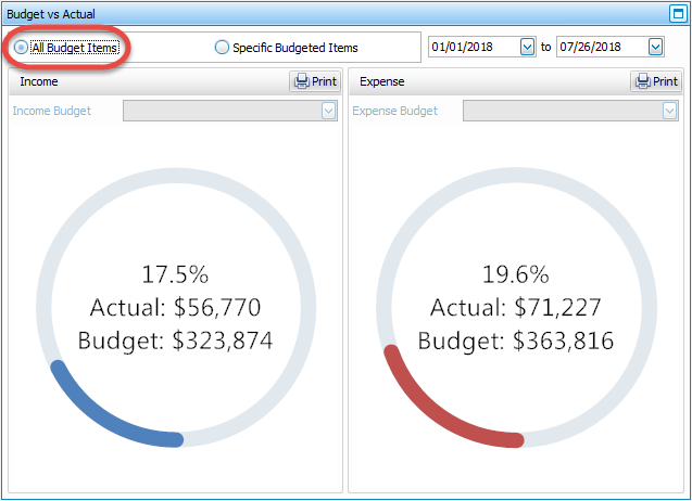
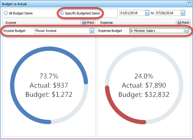
Budget vs. Actual
Choose a date range in the top right to compare your actual Income and Expense to your Budgets for either all or only a selection of your budgets:
- All Budget Items
- Specific Budgeted Items
Fund Receipts / Disbursements
This bar graph compares the Receipts and Disbursements for each fund, or select a single fund from the Ledgers dropdown:
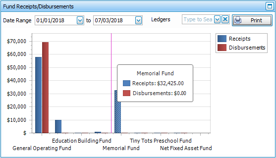
It will default to the first day of the accounting year through today, but you can select any dates you'd like to see.
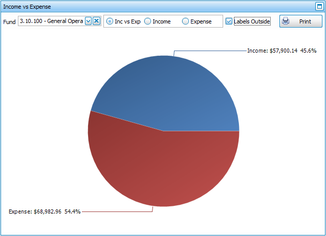
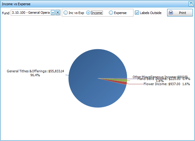
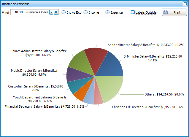
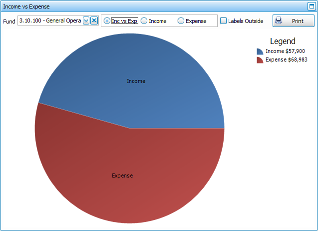
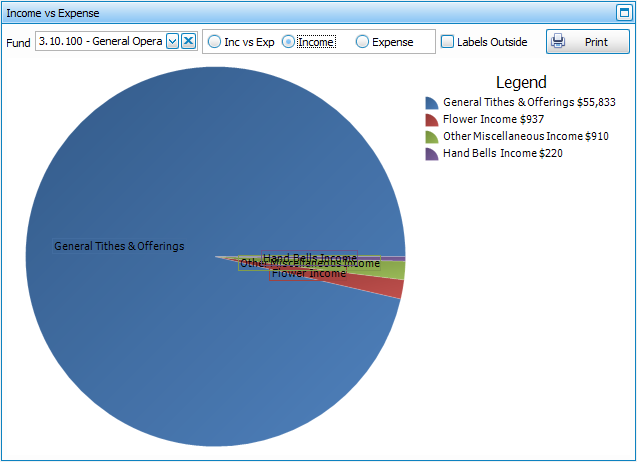
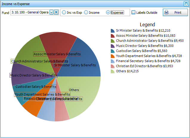
Income vs. Expense
This pie graph provides three display choices for your Funds. Select a Fund from the dropdown and then choose to view either:
- Income versus Expense
- Income
- Expense
The labels for pie graphs can be displayed either on top of the graph, as pictured above; or displayed outside the graph, as pictured below, by putting a  checkmark in the Labels outside box:
- Income versus Expense
- Income
- Expense