Donations Dashboard
Create visual comparisons of Pledges and Donations. View graphs:
Access Donations Dashboard
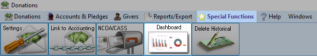
To access from the Button Bar, go to Special Functions > Dashboard
Dashboard Display Controls
Across the top of the dashboard are several toggle switches that turn display for a graph on or off. Any toggles that don't fit can be accessed by clicking the down arrow at the end of the row.
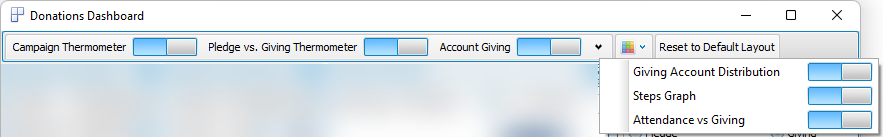
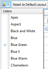
With the Colors menu, select a color scheme to apply to graphs.
Use Reset to Default Layout to return the dashboard to its original setup.
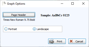
Click Print to view a Print Preview and send the selected graph to your printer. Control fonts and page orientations from the Graph Options window. You can also Exports graphs or Exports from the Print Preview window.
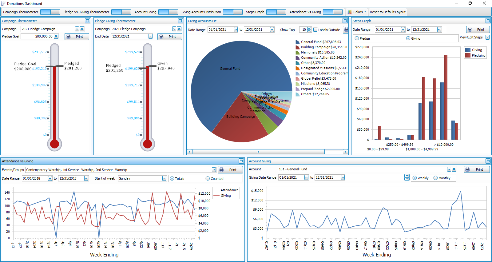
Graphs
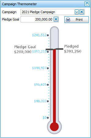
Campaign Thermometer
This graph allows you to choose a Campaign and enter a Goal for how much you intend to raise in Pledges and then compare how close you are to that goal.
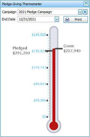
Pledge/Giving Thermometer
This graph allows you to compare how much you have received in donations towards Campaign Pledges.
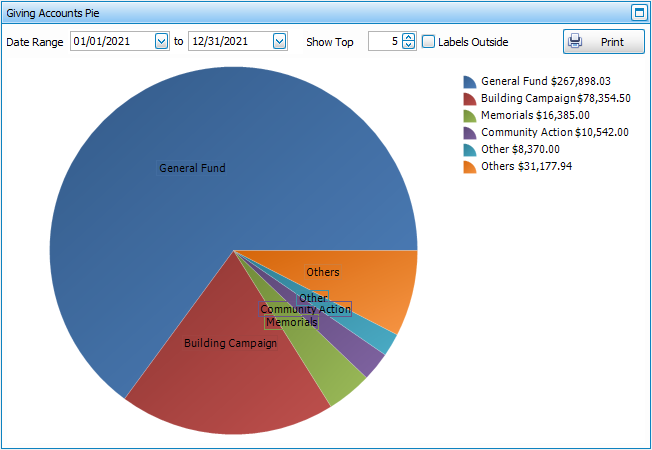
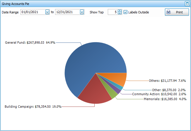
Giving Account Distribution
This pie graph shows the Giving Distribution of how much is donated to every account in the selected date range. Enter a number in the Show Top box to view only a certain number of account, such as the Top 5. The Labels Outside option lets you decide whether you want to show the graph with accounts and totals in a key or whether to show display those around the graph with percentages.
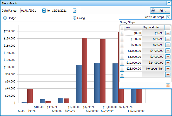
Steps Graph
This graph is a visual representation of the Step Report. Choose a date range in the drop downs and whether you want to see Pledges or Giving. Enter your step ranges by clicking View/Edit Steps.
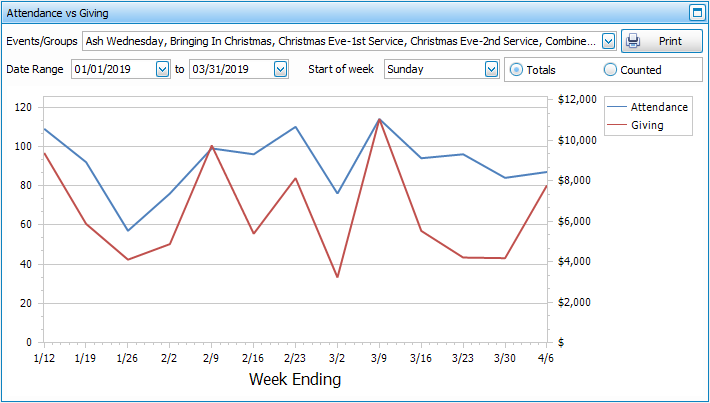
Attendance vs. Giving
This graph allows you to compare the attendance of your Manage Events and/or Groups & Classes. Depending on how you Enter Attendance, you may want to see the Totals, based on recorded attendance for individuals or Counted, based on headcount up against Enter Donations.
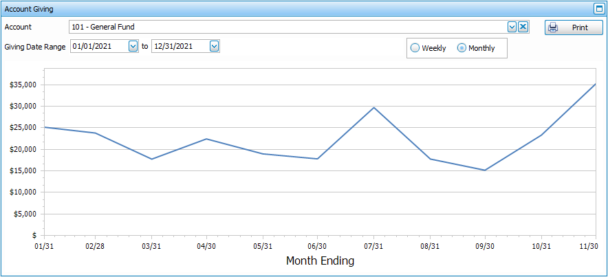
Account Giving
This line graph shows you how much is donated to the selected account on a Weekly or Monthly basis for the selected date range. When you over over a point on the line graph, it will show the exact date and total in a tooltip.