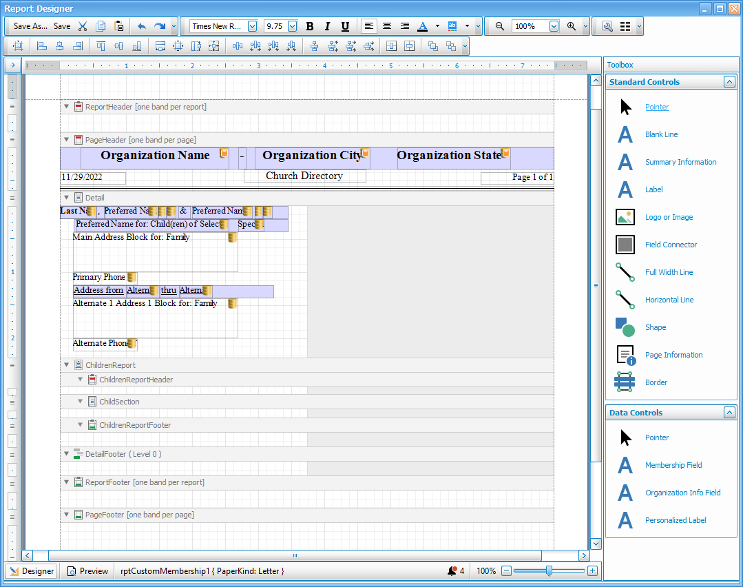
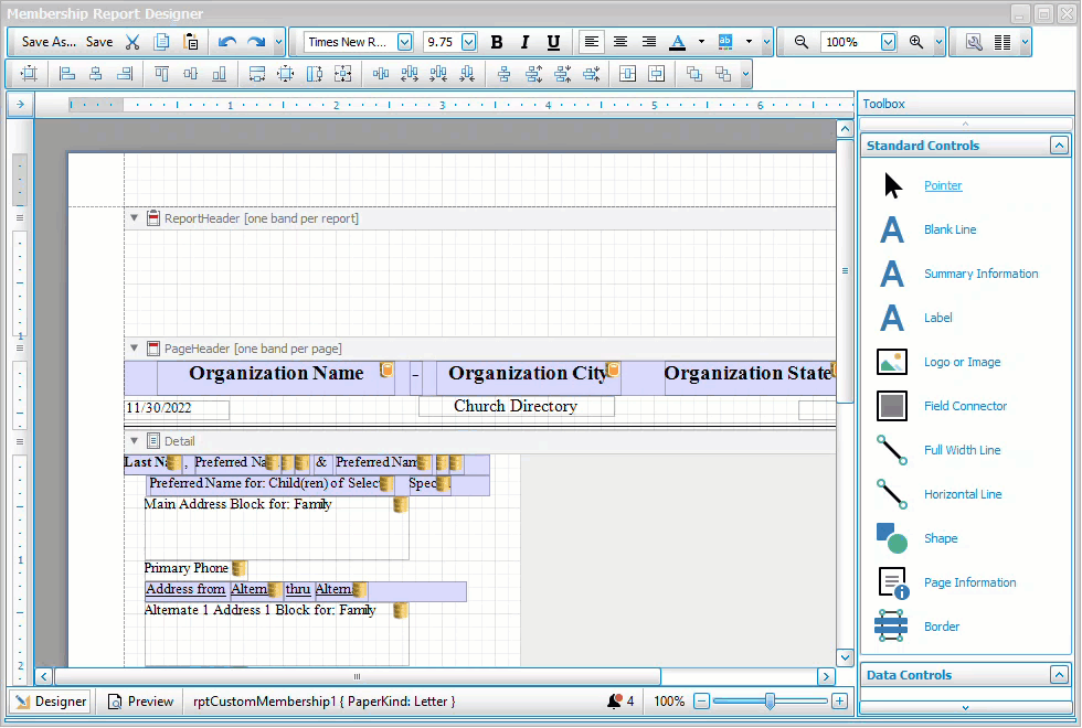
Report Designer
The Report Designer is a powerful tool used to customize the formatting, design, and advanced layout of Reports and Directories. The Select Fields button allows you to choose the content for basic reports using default layout settings, however custom and directory reports have more detailed options within the Report Designer for the individual placement, size, and position of selected fields. The [Template] layouts included with the software can be copied and used as a starting point for a customized layout.
Access the Report Designer
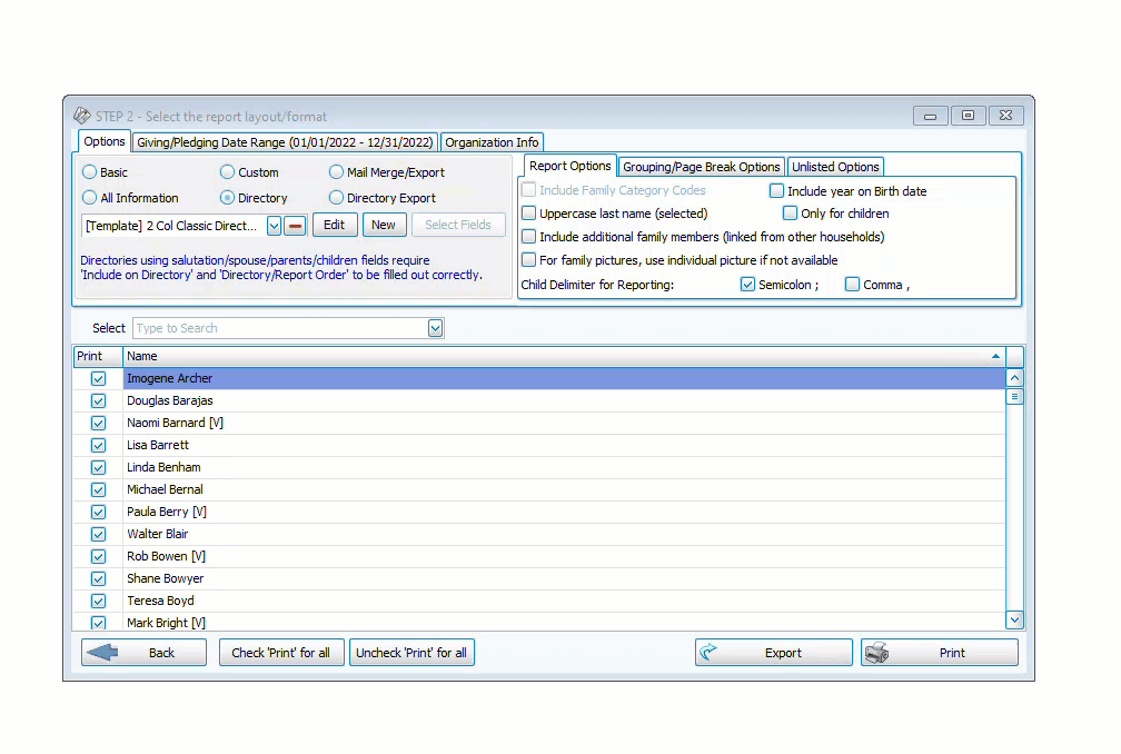
To access the Report Designer, select the layout you want to design from the drop down menu and click the Edit button.
Using the Report Designer
-
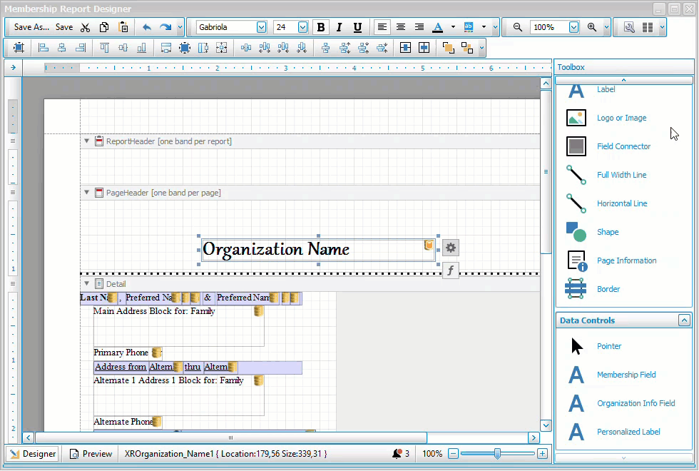
The white grid portions of the screen represent the workable area where you can place content. Light gray portions are often portions sectioned off for the next column which will repeat the layout. Fields backed with a light purple color are inside of a field connector. Fields that have a yellow barrel indicate fields that will pull information from the database. Fields that show up in pink indicate that they are overlapping with another field.
-
Fields can be dragged and dropped with your mouse or, once selected, you can use the arrow keys to move fields. For more minute control, hold the CTRL key while using the arrows on your keyboard to move objects. Holding SHIFT and CTRL will stretch or shrink objects.
-
To move through each field, you can click on one and hit the TAB key to move to select the next field.
-
Clicking and dragging within the grid area will create a box that will select all of the fields it overlaps, allowing you to select multiple fields at once. If the fields are all text fields (make sure that the light purple label connectors are not selected) you can make formatting adjustments like font or size to multiple fields at once. You can also select multiple fields by holding the CTRL key as you're selected or deselecting fields.
-
The
 symbol in the grid typically indicates that you're attempting to insert an object into an invalid section.
Controls and Tool Bars
 Main Toolbar
Save As
Clicking the  button will prompt you to give the report a new name. If you are editing an existing layout or a [Template] layout, this will save a copy with a new title rather than overwrite the existing file.
Save
Clicking the  button will save the changes and update the report you selected to edit.
CTRL + A
Cut
The  button will remove the selected object and store it in your clipboard to be pasted elsewhere.
CTRL + X
Copy
The  button will make a copy of the selected object to your clipboard while leaving the original in place.
CTRL + C
Paste
The  button will place the object currently in your clipboard from Cut or Copy.
CTRL + V
Undo and Redo
These  buttons are the undo and redo buttons. The arrow going to the left will undo your last action. The arrow going to the right will redo an action that was previously undone.
Undo - CTRL + Z
Redo - CTRL + Y
Format Toolbar
Font Name
 The font dropdown window lists the available fonts.
Font Size
 The font size drop down allows you to control the size of the font.
Font Decoration
 These buttons will apply bold, italic or underline effects to text.
Bold - CTRL + B
Italic - CTRL + I
Underline - CTRL + U
Text Alignment
 The text alignment will determine whether text within a field will align to the left, centered or to the right.
Foreground Color
 Foreground color will change the color of text, borders, or lines.
Select a color from the defaults or click the tabs or More Colors... for more customizable options.


Background Color
 Background color will change fill color of the selected field.
Zoom Toolbar
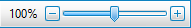
These tools allow you to zoom in or out within the Report Designer. These settings will not affect the printed output, only the display within the Report Designer. You can either use the zoom in and out buttons or dropdown in the Main Toolbar at the top of the screen or use the buttons or slider at the bottom of the screen. Zooming in can help you distinguish and select fields that are small or condensed.
Zoom Out - CTRL + Minus
Zoom In - CTRL + Plus
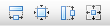
Layout Toolbar
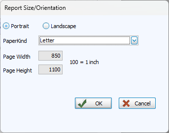
Page Setup
Clicking the  button will open a window in which you change the paper size and page orientation. In order to manually set a paper size by keying in dimensions, select Custom from the PaperKind dropdown.
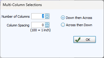
Columns
The  button allows you to adjust settings for columns. The workable grid space will reduce to the leftmost column.
Alignment & Spacing Toolbar 
Align to Grid
 Align the positions of the selected objects to the grid.
Align Fields
 Align the selected objects.
Size Fields
Make selected controls the same height and/or width or size the selected object to the nearest grid lines.
Space Fields
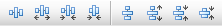
Equalize, increase, decrease, or remove spacing horizontally or vertically between objects.
Center in Section

Horizontally or vertically center objects within a report section.
Send to Front or Back

Send objects to the front or back.
Standard Controls

Selecting the pointer will return your cursor to the original state in order to select objects.
This control will insert a blank line the height of a row of text into the report.

Summary information inserts a report summary, typically including the count of people in the report and selection criteria. This can only be placed in the Report Header or Report Footer sections.

The Label control allows you to insert a label or text field into the report. Double click inside a label to edit the text, or click the  icon to open Label Tasks.
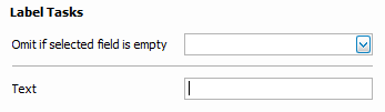
If you do not want a label (usually paired with the corresponding data field) to show blank entries, select the associated data in the Omit if selected field is empty dropdown. If that field is blank for that individual, the label will not appear.

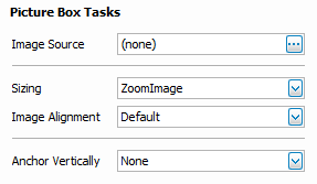
The image tool places a frame in your report that allows you to add an image file from your computer. Valid image file types include BMP, JPEG, GIF, EMF, WMF, TIFF, PNG, ICO, and SVG. To select an image, click the icon of the image frame and click the  next to Image Source to browse to the image file.

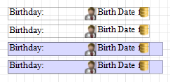
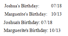
Field Connectors are light purple frames that can hold data fields and labels. Instead of having a label followed by a data field statically positioned, this will place one field after the next. These images illustrate the difference in the designer and result.

Full width line inserts a divider line that spans the widths of page within the margins. Click the icon to open Line Tasks where you can customize the width, style and orientation of the line.
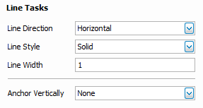

Horizontal line inserts a line that can be set to a length you determine onto the page.

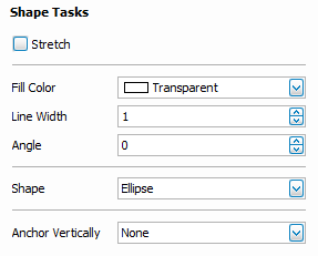
The shape tool allows you to add a simple geometric shape to your report design. Click and drag the shape object onto your report and click the icon to open Shape Tasks where you can choose the shape, settings, and fill color.

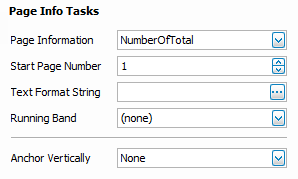
Page Information allows you to insert a variable that provides automatically generated information such as page numbers, date and time stamps. Click the to open Page Info Tasks.
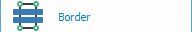
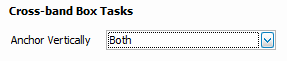
The Border tool allows you to place a rectangular container around objects in your report. This differs from a transparent rectangle from the shape tool in that it can cross through multiple report sections and will now give the pink overlapping alert provided that the border itself and the objects within it are not overlapping.
Data Controls

Selecting the pointer will return your cursor to the original state in order to select objects.

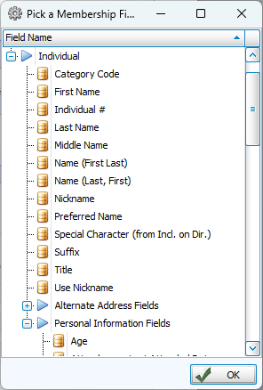
The Membership Field control allows you to add information from Membership into a directory or custom report. Click and drag the Membership Field control onto the report. Releasing the mouse will bring up this window where you can select a field and click ok.
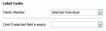
In label tasks, you can choose which person in a household this data field describes. Selected Individual is the Primary in the household, Spouse or Partner is the Secondary. You can also list information for all adults, children, or parents.

Organization Info Field allows you to bring in a data field from System Information. Click and drag the Organization Info Field control onto the report. Releasing the mouse will bring up this window where you can select a field and click ok.

A Personalized Label creates a label with the name of the referenced family member. These are especially useful for identifying unique contact information.
Preview 
In the lower left, you can alternate between the Designer view where reports are built and the Preview view which uses sample data to quickly show what your report will look like.
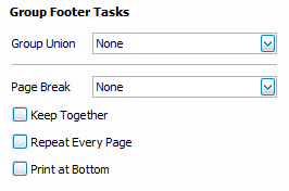
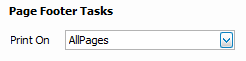
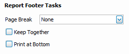
Report Sections
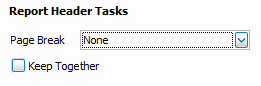
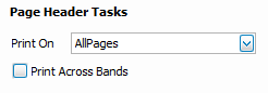
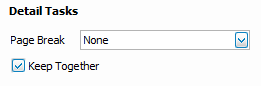
Report sections, also known as bands, are the building blocks of the report. These sections allow you to have a title, page headings, page footers, and content at the end of the report. These can also be used to insert page breaks or customize headings. Click on the to open the options for that section. To change the height of a section, hover over the dividing line until a vertical, double-sided arrow appears and then click and drag to the desired height or you can click and drag the sliders  on the vertical ruler on the left.
Header
Report
Content in this section shows on only the first page of a report.
Page
Content in this section shows at the top of each page of a report.
Detail
Detail
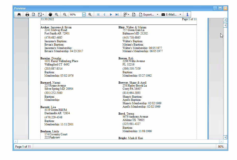
This is where the bulk of the content in a report is housed. Each detail section will repeat according to the layout for each person or household.
Children's Report
Content within the Children's Report section operates similarly to other sections, but only shows information for those with a Directory Report order of 3 - Child with Family. You might use this section to have fields for each child in the household but only for the children.
Report Header
Appears once for each family with an individual with a Directory Report Order of 3 - Child with Family.
Section
Appears once for each individual with a Directory Report Order of 3 - Child with Family.
Footer
Appears once for each family with an individual with a Directory Report Order of 3 - Child with Family.
Footer
Detail
Appears at the end of each detail entry.
Page
Content in this section appears at the bottom of each page of the report.
Report
Content in this section appears at the bottom on the last page of the report.
Popular Functions
Add a Field
-
Open the template or layout you want to edit in the Report Designer.
-
Click and drag Membership Field into the grid.
-
Select the field you want to add and click OK.
-
If needed, open label tasks by clicking
and indicating the Family Member this field is for. -
To hide the label if the field is blank, click on
for that label and select recently added data in the Omit if selected field is empty dropdown.
Hide Empty Field Labels
-
Click on the tasks icon
for the label you want to hide. This is the Label or Personalized Label that is next to the data that is blank for some people. -
In the Omit if selected field is empty dropdown, choose associated data and family member.
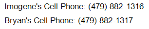
Add a Cell Phone Field
-
Open the [Template]...with cell that you want to use for your directory.
-
Click and drag Membership Field next to the Personalized Label for Cell Phone.
-
Select the field for cell phone under Individual > Personal Information Fields. Fields are alphabetized by how they are titled in Customize Fields, so if you use the term "Mobile Phone", look in the M's rather than for "Cell."
-
Open label tasks by clicking
and indicate whether this field should have the Primary or their Spouse's cell phone. -
On the personalized label, click on
and select the data you just added in the Omit if selected field is empty dropdown. -
Repeat Steps 2-6 for the next Personalized Label for Cell Phone.
Create Multi-Column Lists
-
Create a Basic layout by clicking
 in the Step 2 - Layout window. Give the report a name and choose the fields for your list.
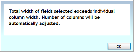
To ensure adequate space for columns, you may want to reduce the widths in the Column Selector. If the fields do not fit the space allowed by the columns, you will get this alert.
-
Click
 to open the Report Designer.
 -
Click the
button in the toolbar at the top of the screen. -
Indicate the desired number of columns and spacing and click OK.
-
Click
and close the Report Designer. -
Click
 to view your report.
Add a Logo
-
Choose the layout you want to add a logo to in Step 2 - Layout and click
. -
If needed, adjust the section where you will be adding a logo to create space for it.
-
Click and drag the Logo or Image control to place it in your layout.
-
Click the
on the image frame to open Picture Box Tasks.
-
Next to image source, click
and locate the image. -
Resize and adjust settings as needed and save the layout.